One painting · one wall · one name
نيا — a name you can walk around
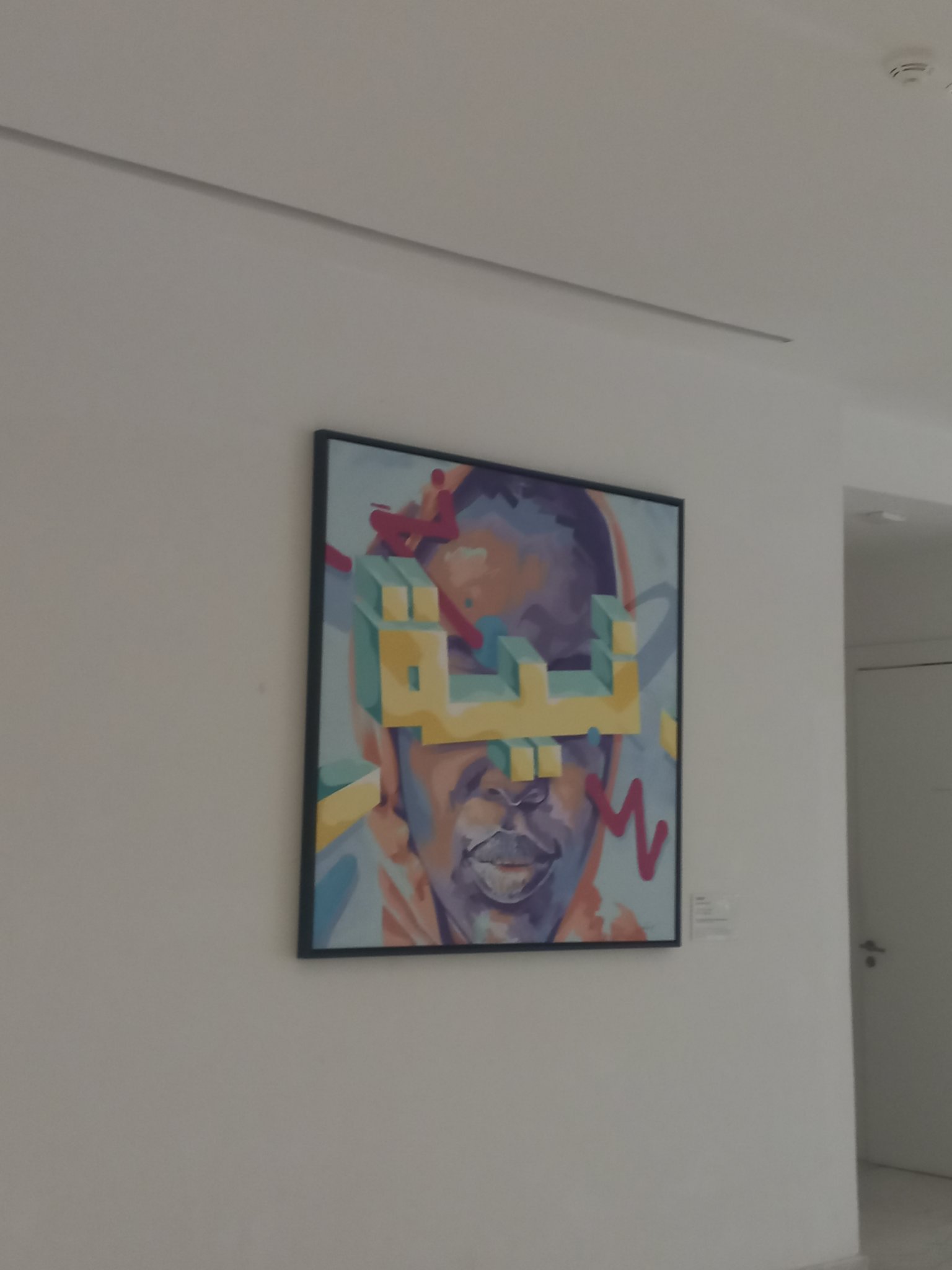
Some paintings you look at. This one you look around — because the word at its center has depth, weight, and shadows, like a small building dropped into the middle of a portrait.
First impression
It hangs on a plain white wall, framed in black, and it refuses to behave like a flat image. Your eye lands first on the big yellow blocks — chunky, three-dimensional Arabic letters with teal sides, stacked and interlocked like toy bricks left mid-game. Then the face surfaces underneath: a portrait in violet and ochre, calm, half-hidden, watching you notice the letters. Then the magenta gestures — quick red slashes and a zigzag — crackle around the edges like the whole thing might start moving.
It reads as celebration. Not a quiet, gallery-whisper kind of celebration — the loud kind, the kind with music.
The letters
Look closer and the yellow blocks resolve into a word: نيا — Nia. Three letters, built like architecture. The ن leans, the ي stretches, the ا stands straight, and together they hold up the composition the way columns hold up a roof.
There is a long tradition of Arabic calligraphy treating the word as image — but here the word is treated as object. It casts shadows. It has sides. You could imagine picking it up. A name, rendered as something you could bump into in a hallway, is a strange and tender idea: identity with volume.
A name, rendered as something you could bump into in a hallway, is a strange and tender idea: identity with volume.
The face behind
Beneath the letters, the portrait keeps its composure. Painted in purples, blues and warm ochre, the face is stylized but present — eyes lowered or closed, mouth calm. It doesn't compete with the letters; it carries them. There's something generous in that: the person underneath, holding up the bright loud name without flinching.
The layering matters. The word is in front, the person behind — as if to say the name goes out into the world first, and the self follows, steady, underneath it all.
Color as language
The palette does half the talking. Yellow for joy, or sunlight, or just the refusal to be muted. Teal cooling the yellow's edges. Violet and ochre for the human part — dusk colors, interior colors. And the magenta marks, quick and unplanned-looking, are the artist's handwriting: I was here, I was excited, I couldn't resist one more stroke.
Why it stays with you
Most portraits ask: who is this? This one asks something else: what does it feel like to be named? To have three letters that people say when they mean you — and to see those letters built solid, bright, unmissable, standing in front of your face like they belong there.
Walking away from that white wall, the image that lingers isn't the face or even the word. It's the shadow the letters throw — proof that a name, given enough love, takes up real space in the world.
— for Nia.